Monday, May 21, 2012

Side table make over!

Hello All! It has been a long and exhausting/boring unemployment. My first week off was so lovely, and the second week off: so productive. And since then, I have been suffering a bit from cabin fever. I don't know what to go explore and I get down in pit of lazy on most days.

But don't feel bad for me. I'm laying in bed typing this at 11am, watching The Price is Right.

Meanwhile, and the point to this post, is that I have finished a side table make over that I had planned as my unemployment project for this hiatus. 


Here was my inspiration:

via Pinterest

I love this color on an end table, along with all this detail, and matched with the mirror above. It feels very Mediterranean. I am starting to try to branch out and get in touch with my colorful side - as I tend to always veer toward earth tones - and what  better way to do that than pull things from my Mediterranean heritage!?

I was given a free end table and I was excited to use the Martha Stewart Interior Paint in the color of Palmetto, which is the same color used on the table above.

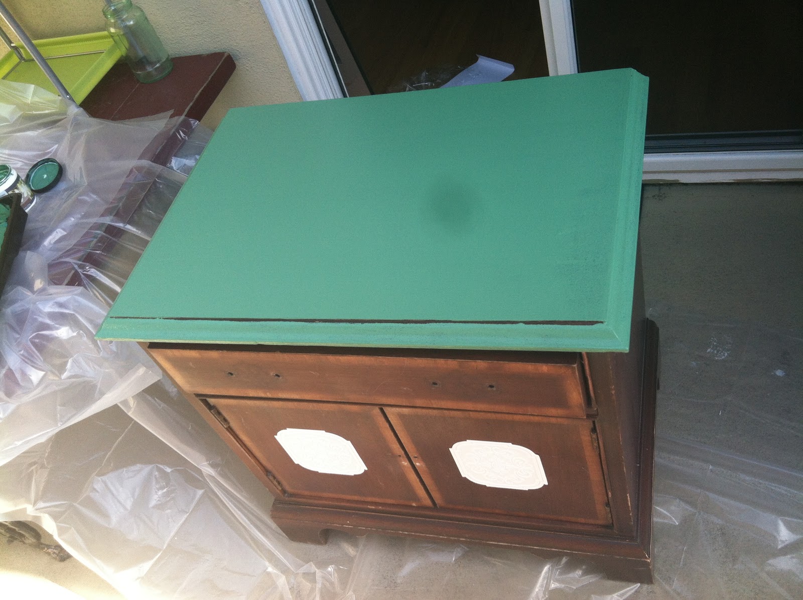
The end table was made of particle board and wood laminate. After much research, I decided that I still need to sand it down to get rid of the light gloss coating on top. I wanted the final product to look old and aged, so I lightly sanded the entire table, but then took a hammer and dinged up the edges of the table top, the doors and drawer.


Next, I wanted there to be a little bit more detail in the wood, that didn't currently exist, but that you would normally see in authentic Mediterranean style furniture. I've recently become aware of paintable wallpaper that comes in different patterns. The great thing about paintable wall paper is that the patterns are very similar to some wood work type patterns. I found this roll of paintable wallpaper trim that had a pretty pattern at Lowes (and that is the only store I found it at). I originally bought the trim to use on an Ikea Hack, to put on the drawers of a MALM dresser I have, just to spice it up. I haven't gotten that far yet, and after seeing how easy this project was, maybe I will pick that project back up.


 I cut the center shape out of the wall paper trim, so that I could just give the center of the doors some detail. Like any self stick wall paper, you soak this in luke warm water, fold it onto its sticky self for a few minutes, which will make the glue tacky. 


Once the time is up, you position the wall paper onto the door. It doesn't seem like it will stay on, as it is easily reposition-able and I was worried it wouldn't be strong enough. Once you have the positioning down, just leave it alone for a couple of hours. Sure enough, it will stick.


Then I got to painting! I used a foam roller brush to cover more area quickly. I used a 2" bristle brush to get in all the nooks and crannies.


Once I got the Palmetto paint on ( I did 2 coats overall), I got to mixing my glaze for antiquing. I chose a light brown that I thought would look well with this green to give it just a bit of an "i've been sitting around for a while" aged look, but still be pretty. A lot of people will use an almost black color to age, and it would be more effective and more visible, but I chose for my first ever antiquing glaze to go a bit more subtle. You mix 1 part paint color with 3 parts glaze. I don't remember exactly what brown paint I chose, but I used Behr Faux Glaze for the application.


So, you take your mixture and a bucket of water and a washcloth. You paint on the glaze mixture, as thick or as lightly as you wish. Moments after, you take the wet cloth and wipe it off. As long as you don't press too hard, the glaze will stick in all the small dings and nooks. Go over it as many times as you want. I paid extra attention to the edges and corners, as that would probably naturally have been handled most.  I also lightly brushed all over just to age the paint color itself, but wiped away immediately, and did that over and over until I liked what I saw.


The painted wallpaper looks really great and appears to be part of the doors once all is said and done. There are a lot of small spaces that made it great for the glaze.


Once finished and dry, I re applied the original hardware. I was going to get some fun vintage hardware from Anthropologie, but the dimensions for the original hardware holes were an awkward measurement that most hardware did not match. And the holes for the knobs on the doors were far too close to each other. I didn't feel like filling holes and drilling new ones, and the original hardware looked antique-y enough for me.
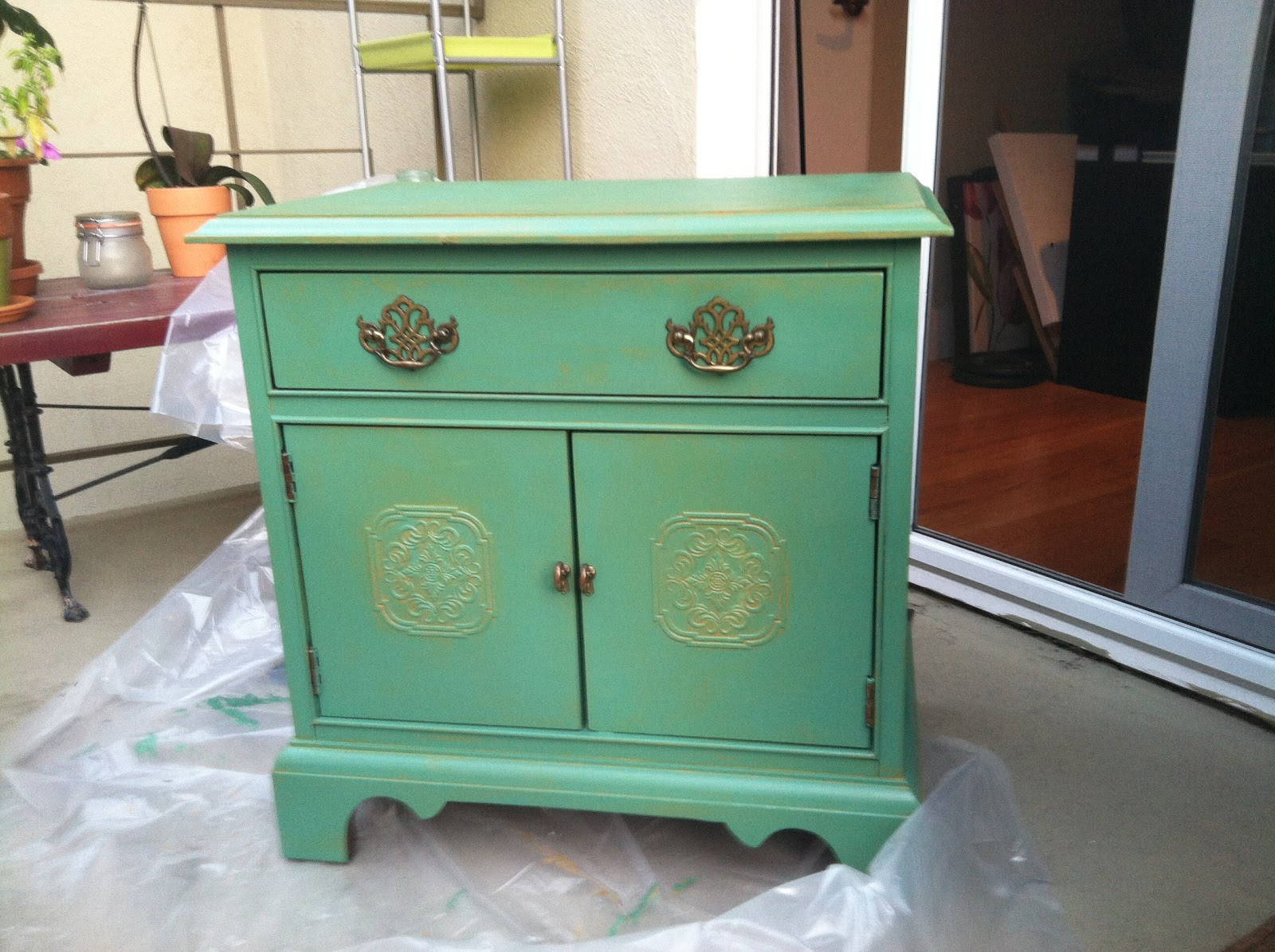

VOILA!


Two things to note: I used a spray sealer in order to make it water proof and/or scratch resistant. And it didn't work. I am currently patching the top and I bought a Polyurethane protective water based paint to coat on the top. I got it in a satin finish so that it wasn't glossy and a massively different finish to the rest of it, but a nice finish none the less.

Secondly, If i had done anything else differently, I probably would have liked to maybe cut a strip of paintable wallpaper the length of the drawer, to add some extra detail. Still possible if I decide to up date it. But for now, I am pretty happy with the outcome! :)

Monday, May 14, 2012

C is for... "Chinatown" & "A Clockwork Orange"


Chinatown (1974)


Director: Roman Polanski
Production Designer: Richard Sylbert
Set Decorator: Ruby Levitt

Chinatown is known in the film world as one of the most outstanding masterings of production design. It is one of the most authentic looking period films, and that is thanks to both Polanksi's vision and style and designer Richard Sylbert's keen eye.

As for the time period, Chinatown didn't use the typical locations and landmarks that most time period movies taking place in LA normally would have. In fact they didn't use many landmarks at all, if any, really. Most of the shots were in remote locations to emphasize the time when LA was still remote and a desert town. Or they used tight shots of the particular building they were moving into, or start at the door and inward.


They also decided based on the premise of the film, that all sets would be in dry land colors: brown, tan, beige, and everything in between. 


EXCEPT, however, at the Mulwray's house, where they have been part of a water scandal, there is a LOT of green.


 A Clockwork Orange (1971)


Director: Stanley Kubrick
Production Designer: John Barry

I love watching movies from decades ago and seeing what they thought the future would look like. Or maybe it isn't REALLY what they thought it would look like, but it moved the story forward. Either way, this film takes place in the unforeseen future. This film is very violent and provocative, which may not be easy for everyone to watch, and was shocking for the time it was made.  This futuristic Great Britain gives the sense that sex is much more acceptable in their society and you get that from some of the sex scenes and from some of the decor:


The club where the boys go to drink their drug-laced milk is a high society hangout. All the tables are female mannequins in a bridge with flashy colored wigs. The milk is poured through another female mannequin's nipple. The second picture shows one of the boys' victims, The Cat Lady, in her work out room. Surrounding the room are pictures of nude women in very provocative poses. On the credenza near the door, there is a large porcelain penis statue. 

Speaking of The Cat Lady's apartment, we are introduced to two different sets of victims in the film. Second is The Cat Lady, but first is Mr and Mrs Alexander, where they beat him and rape her (*shudder*). Their home is very VERY modern with chairs that resemble pods and clean white sterile feeling walls. There are a lot of clean lines, emphasized by the rows of book shelves behind Mr. Alexander while he sits at his typewriter.


If you notice both apartments are of people who appear to be upper class. While the Alexander's home is sterile and with some pops of color, The Cat Lady's apt features of LOT of cool tones. Blues and Purples and greens. These cool colors are also represented in the wigs in the fancy shmancy milk bar:


On the other hand, our antihero Alex's home is full of bright colors and the more obvious futuristic elements like the use of aluminum on walls and furniture, which in contrast to the upper class homes, feels a bit more tacky. Also the record shop where he shops has the bold bright colors, and feels like the partiers and not so serious citizens visit this store regularly. As a result, this adds undertones of social tension and conflict without it being apparent or the need for exposition.


Lastly, as a way to express that this takes place in the future w/o having to state where and when, the designer added empty spaces and glimpses of buildings we would see today in ruins or abandoned. For example, right in the lobby of Alex's family apartment there is remnants of art, a style of art that we would recognize, all over the walls, except that it has all been graffitied over and vandalized. This insinuates that it has been a while since that art was put up, and possibly even noticed or respected.


That's it for the letter C! Hopefully I will have another letter for you sooner than later!

xo

DML

http://myatozchallenge.com


Tuesday, May 8, 2012

My Personal A to Z Challenge: Production Design!


As I was searching for Portugal symbols this morning (in research for tattoo ideas), I came across Julie Dawn Fox's blog, where she is working on an A-Z on all things Portugal. I was surprised to see that she linked to other people doing the A to Z Challenge, specifically about Portugal (as you can do it on any topic you want). I was surprised to see that these women are transplants from one country now living in Portugal and its so interesting to see what they are getting from the experience. I myself, have never even visited Portugal, but grew up in a house where my mother and her whole family are from the Azores. Portuguese traditions were very prominent in my upbringing and my heritage. I can't wait to visit there someday. 

Anyhow, the A-Z challenge is perfect for me! I started this blog while I was in between jobs to keep me productive. I've slowly lost most of my motivation lately, and this is just the thing I needed to get my juices flowing again. This will be a fun exercise and further training while in between shows, as well as also maintaining my blog:


I will choose films starting with the appropriate letter of the alphabet and try to find pictures exemplifying their production design and discuss their design choices at whatever length I can. I will probably try to do a couple for each letter, because I have too hard of a time choosing just one favorite (in EVERY aspect of my life: color, ice cream flavor, deodorant...). Hope you will all enjoy this as much as I will! :)